1/2
2/2
1/2
2/2
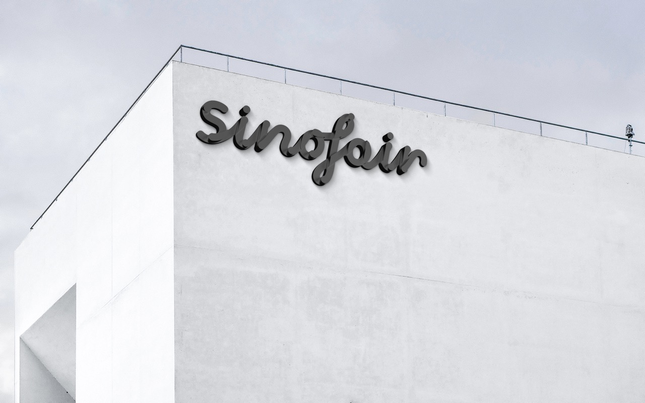
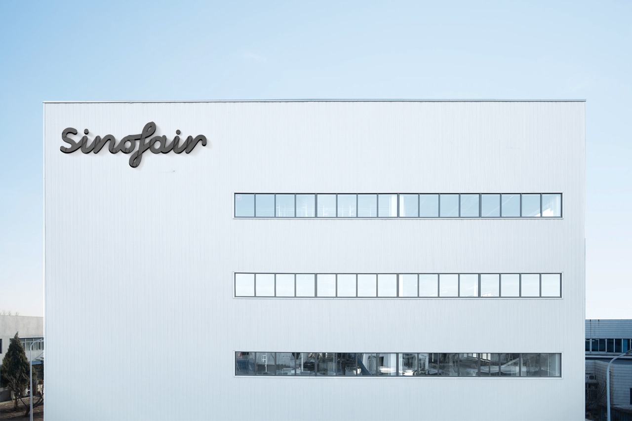
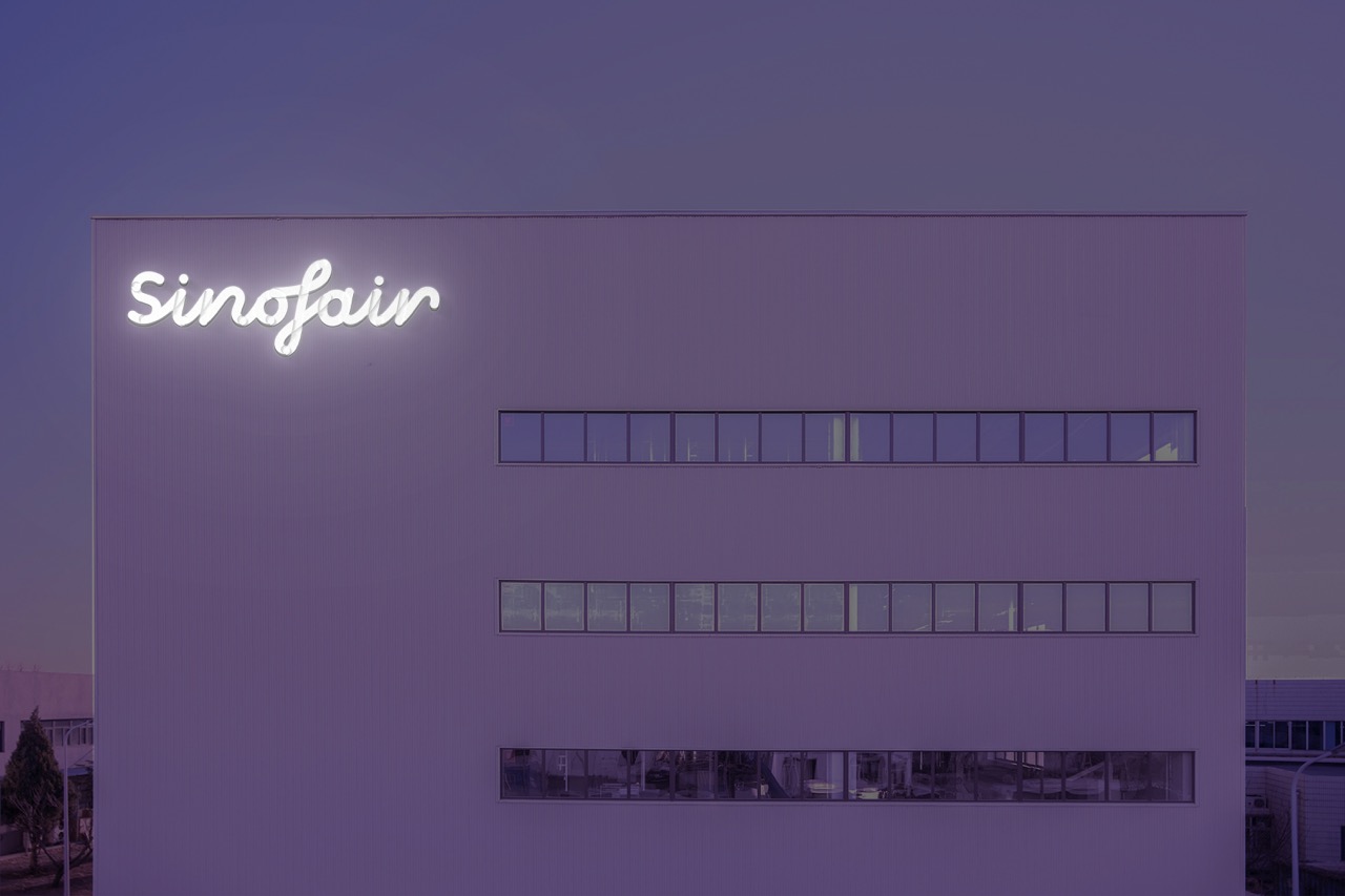
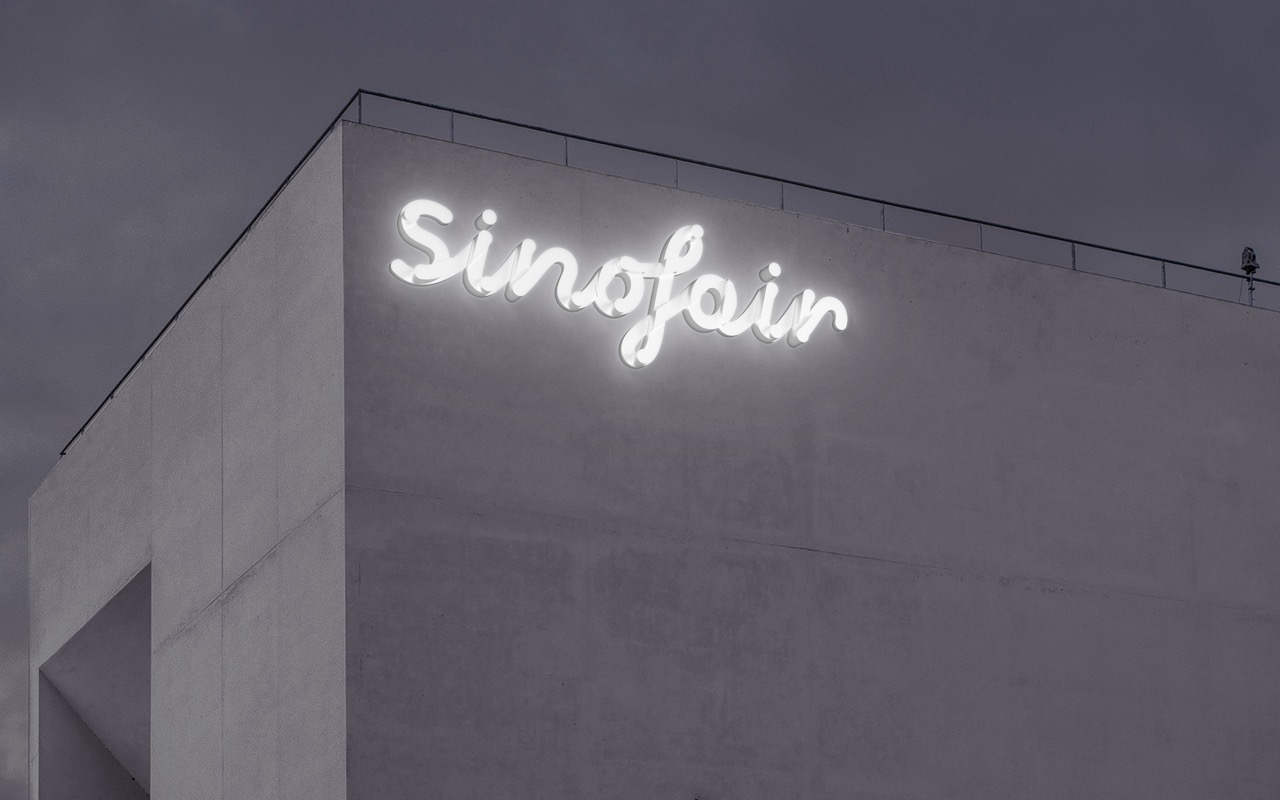
The logo design for sinofair focuses on expressing the concept, emotion, and value of "line." Within a seemingly single-line structure, it conceals multiple curves that intertwine and overlap, connecting seamlessly in a loop horizontally, vertically, and laterally. This interconnected and orderly weaving forms a closed loop, symbolizing the smooth and stable quality of Sinofair and the sustainable cycle of materials.
The strong contrast between black, white, and gray aligns with the specific attributes of the industry, reinforcing a concrete typographic form and imparting a brand with a warm, soft, and delicate abstract emotion.